Reliable, up-to-date information
Outdated or inaccurate restaurant details and limited, unhelpful reviews made information difficult to trust.
iHungryBear
iHungryBear is an established restaurant discovery app in Taiwan with 90,000+ users. We redesigned the mobile experience to make restaurant discovery more personalized, trustworthy, and community-driven.
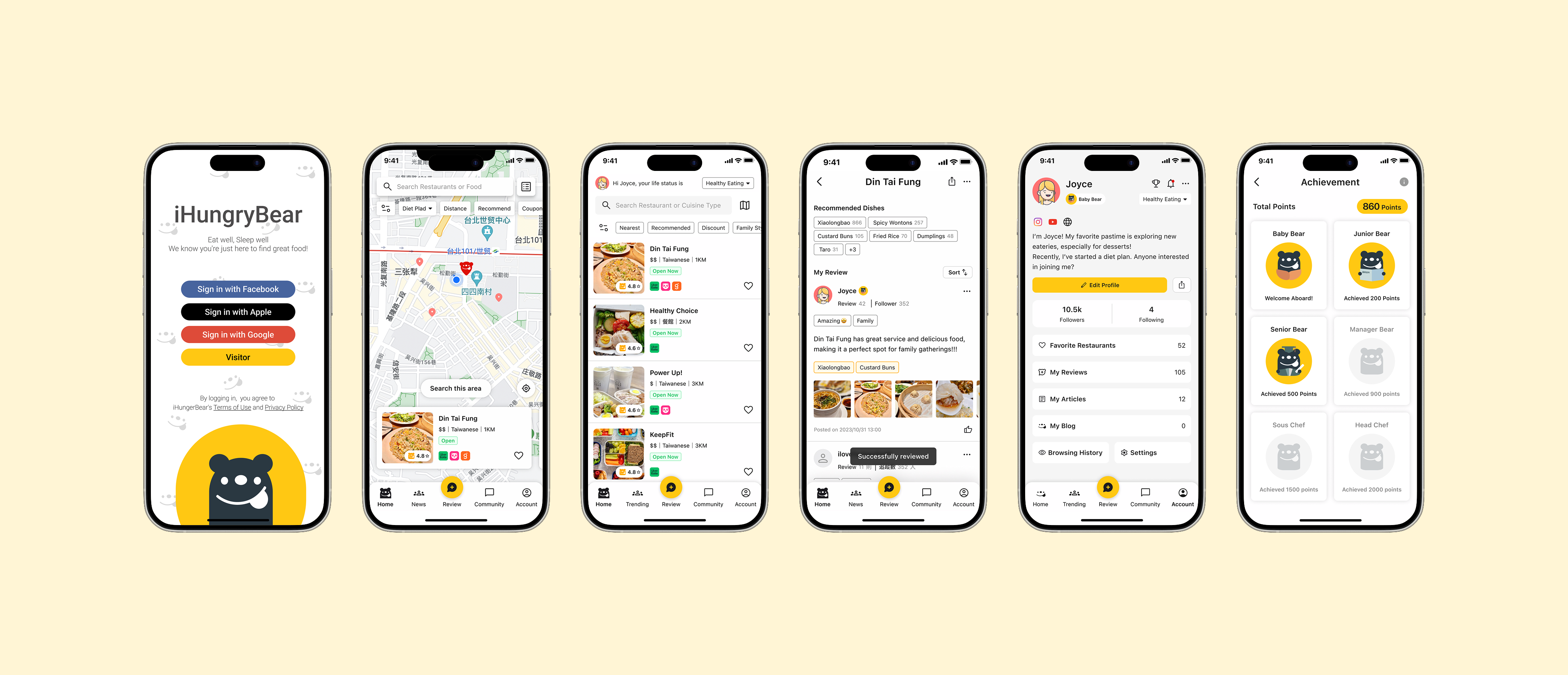
At a glance · Outcome
Results from testing the redesigned experience.
01 / Overview
iHungryBear helps people in Taiwan discover restaurants, browse reviews, and share dining experiences. But overwhelming choices made discovery difficult, while limited participation reduced the usefulness of community content.
Our redesign explored a more personalized mobile experience, with better reasons to share useful reviews and recommendations.
How might we make restaurant discovery feel more personalized, trustworthy, and community-driven?
02 / Research
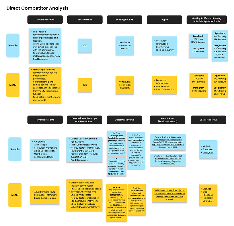
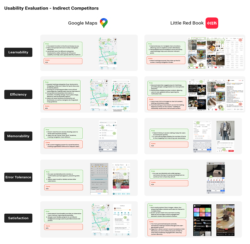
We analyzed direct competitors iFoodie and MENU, and indirect competitors Google Maps and Little Red Book, to identify usability strengths, feature gaps, and opportunities.
We interviewed 10 participants familiar with restaurant-finding apps, focusing on behaviors, feature preferences, and challenges in finding and evaluating restaurants.
The synthesis revealed a gap between what users expected from restaurant discovery tools and what the existing experience provided.
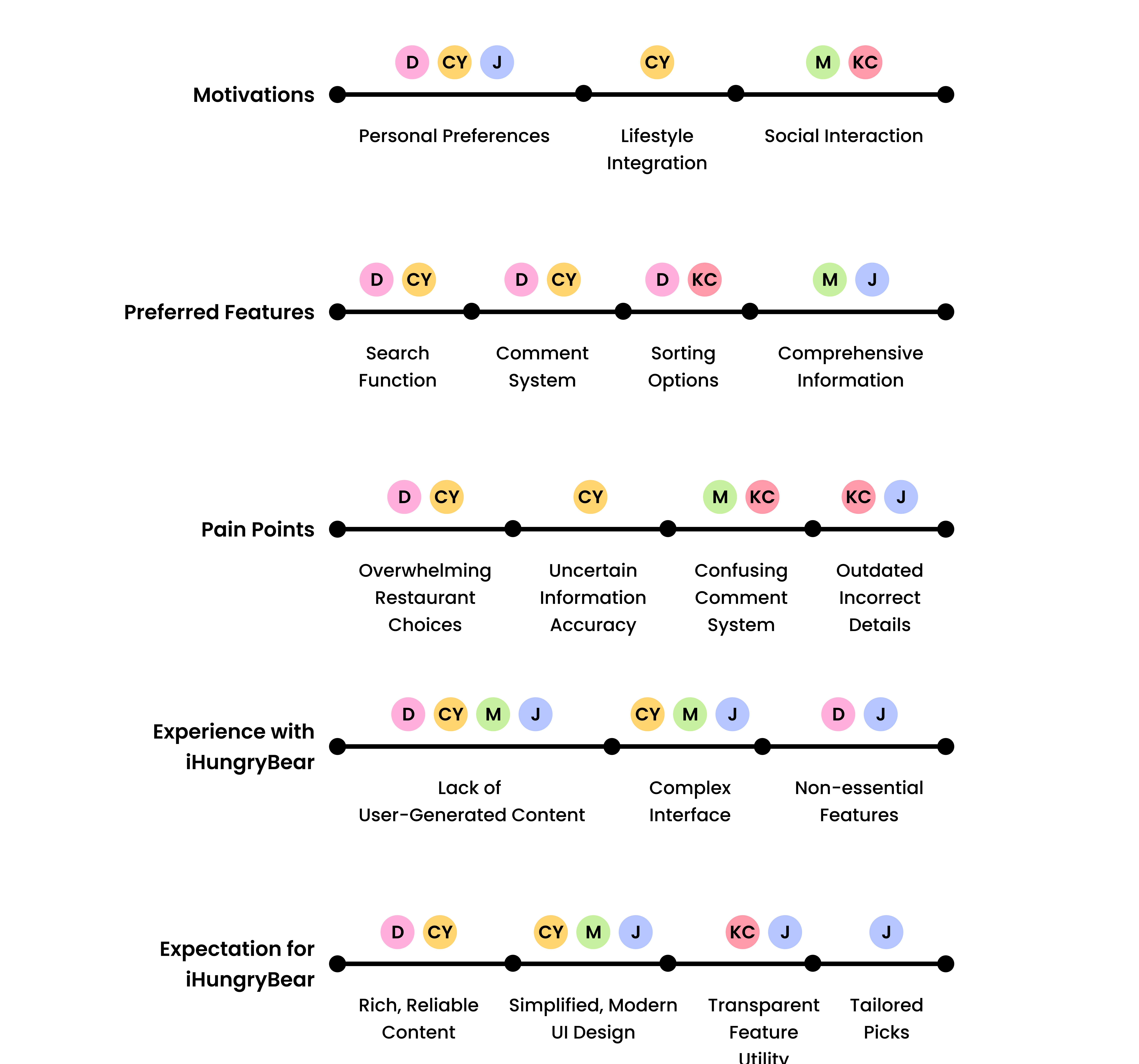
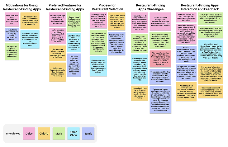
Outdated or inaccurate restaurant details and limited, unhelpful reviews made information difficult to trust.
Unorganized choices and a complex interface made finding a restaurant overwhelming.
Users wanted recommendations tailored to their preferences and lifestyle.
Users needed useful community content and opportunities for social interaction.
Interviews revealed two distinct discovery needs: social diners wanted recommendations they could explore and share with others, while busy families prioritized relevant options that fit practical needs.

Persona 01
Wants to discover new restaurants and exchange recommendations with like-minded diners.
Needs
Persona 02
Wants to quickly narrow choices around family and lifestyle needs.
NeedsWe mapped Joyce’s experience planning a dinner gathering with friends. The journey revealed friction across the discovery process—from overwhelming choices and unclear filters to outdated reviews.
Scenario: Joyce plans a dinner gathering with friends.
The opportunityHelp users move from uncertain browsing to confident decisions, then turn their dining experience into useful community knowledge.
03 / Direction
Research pointed to a broader problem than restaurant availability: users needed a more reliable and personalized way to narrow their choices, along with useful community content they could trust.
Concept exploration
We explored ways to make restaurant discovery more relevant while giving users stronger reasons to share useful community knowledge. Three directions emerged from the research.
01
Help users narrow choices around real-life priorities.
Personalization
02
Make recommendations more useful through questions and polls.
Community
03
Give contributors visible recognition for sharing useful content.
Engagement
04 / Design
Feature 01 · Personalization
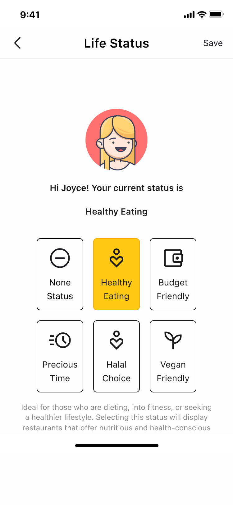
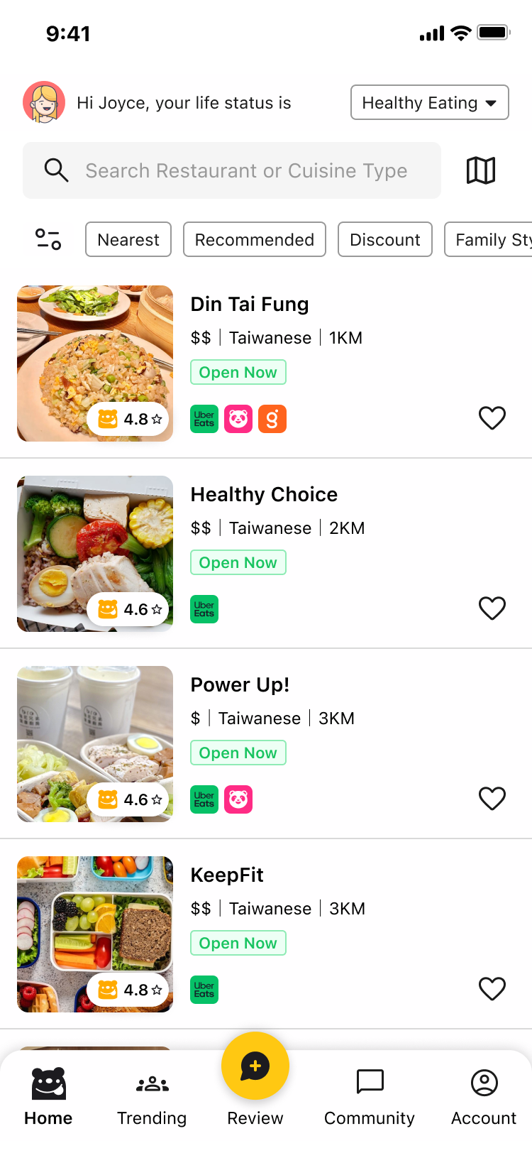
Life Status lets users tailor restaurant recommendations around priorities such as healthy eating, budget, time, and dietary preferences.
Users were overwhelmed by irrelevant choices and wanted faster ways to narrow restaurants around what mattered to them.
Feature 02 · Community
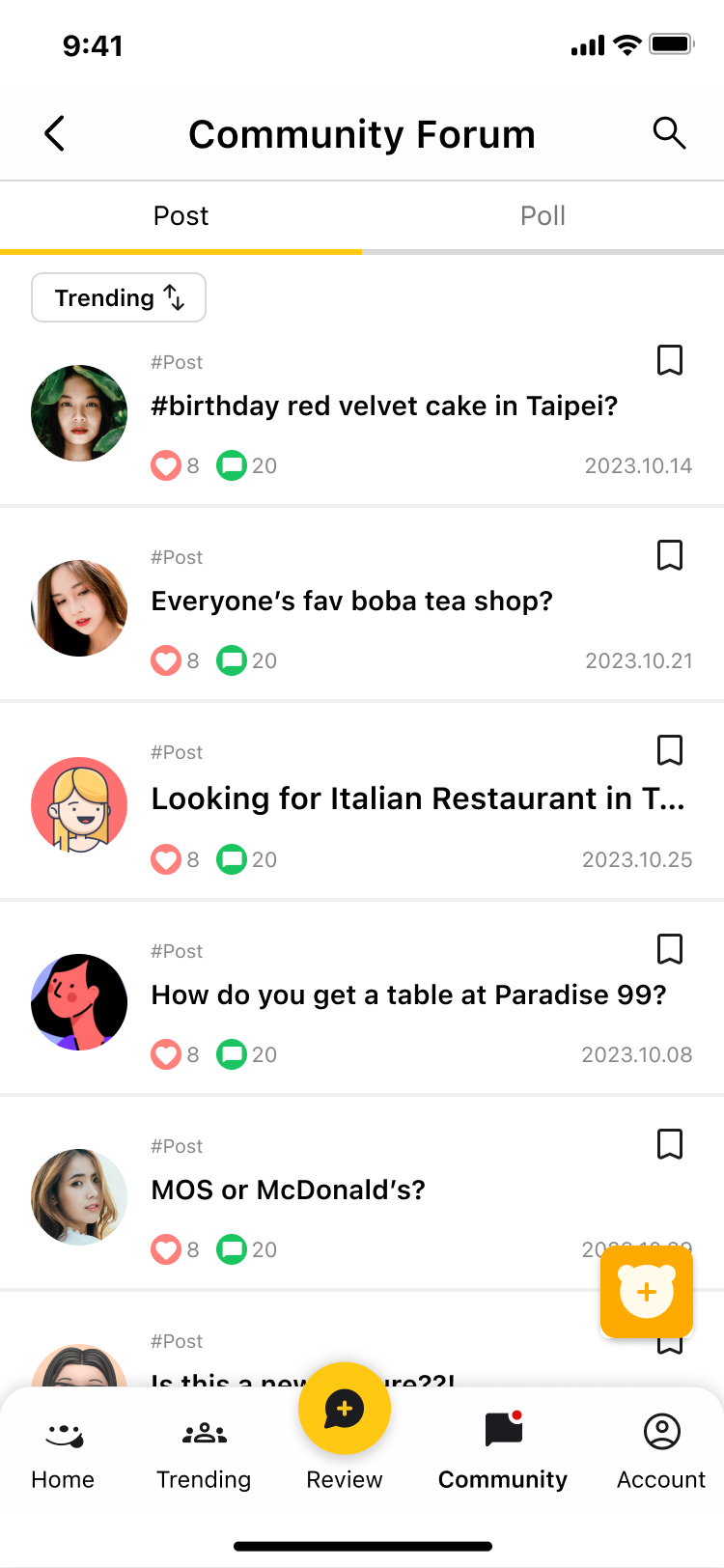
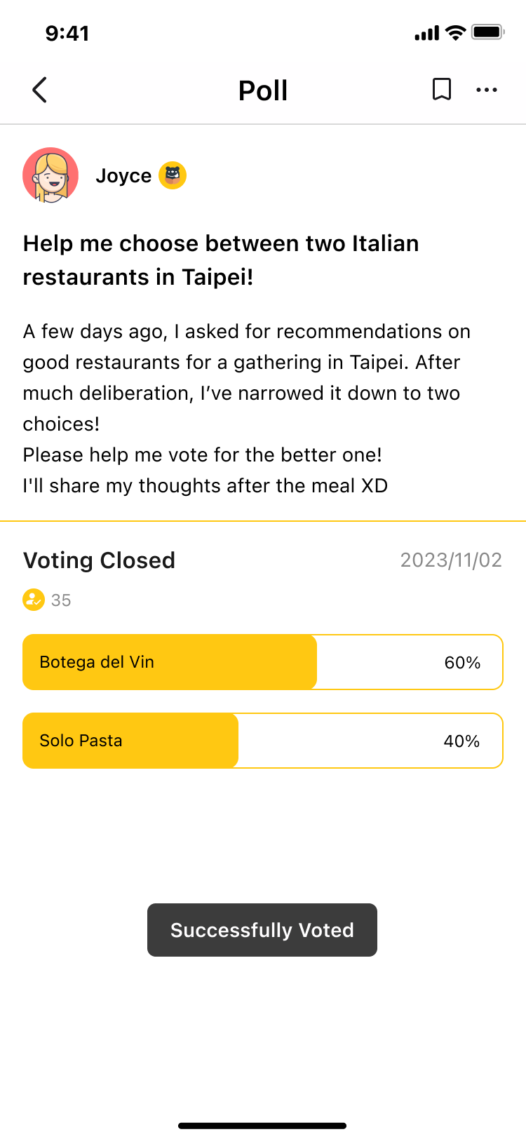
The Community Forum lets users ask questions, create polls, and exchange recommendations beyond traditional reviews.
Users wanted more useful community content and ways to interact around restaurant decisions—not just read static reviews.
Feature 03 · Engagement
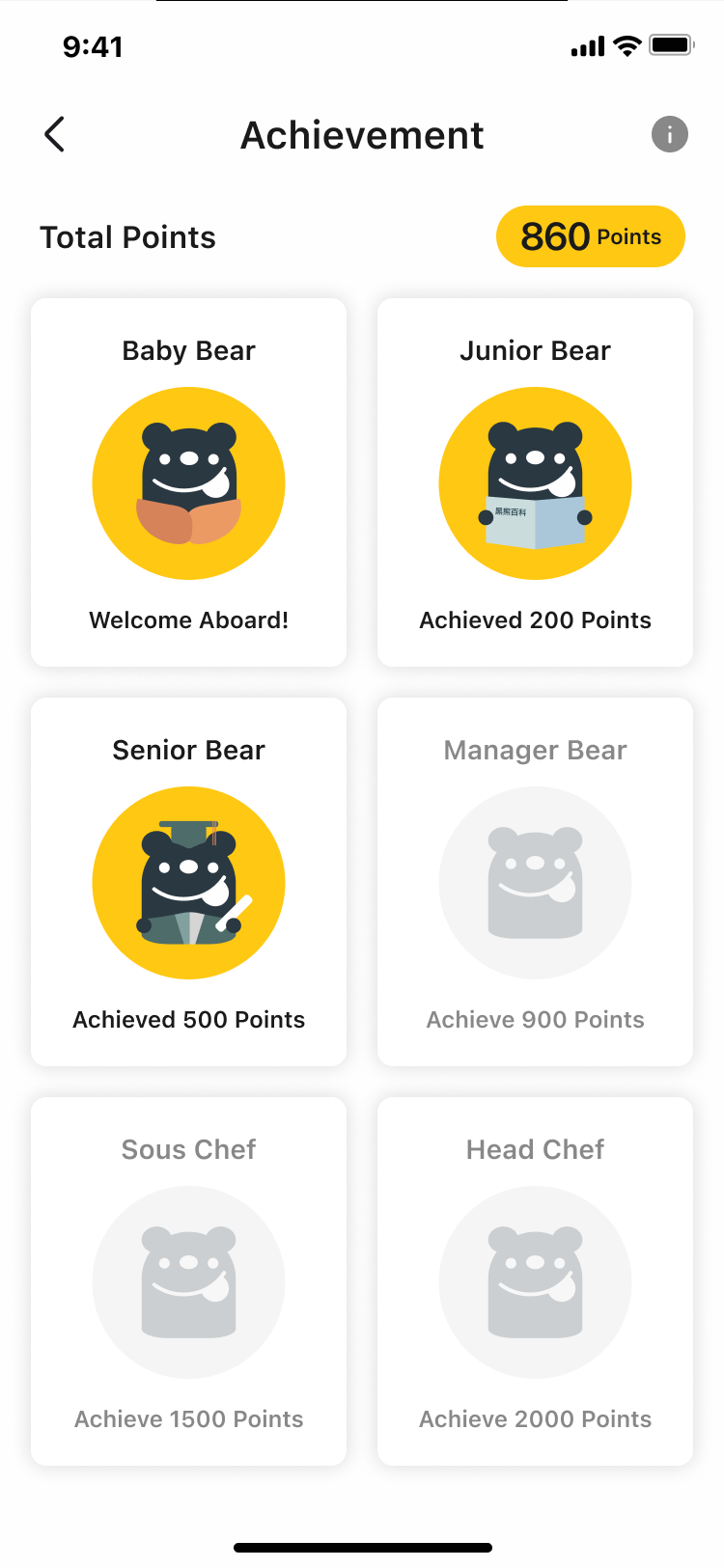
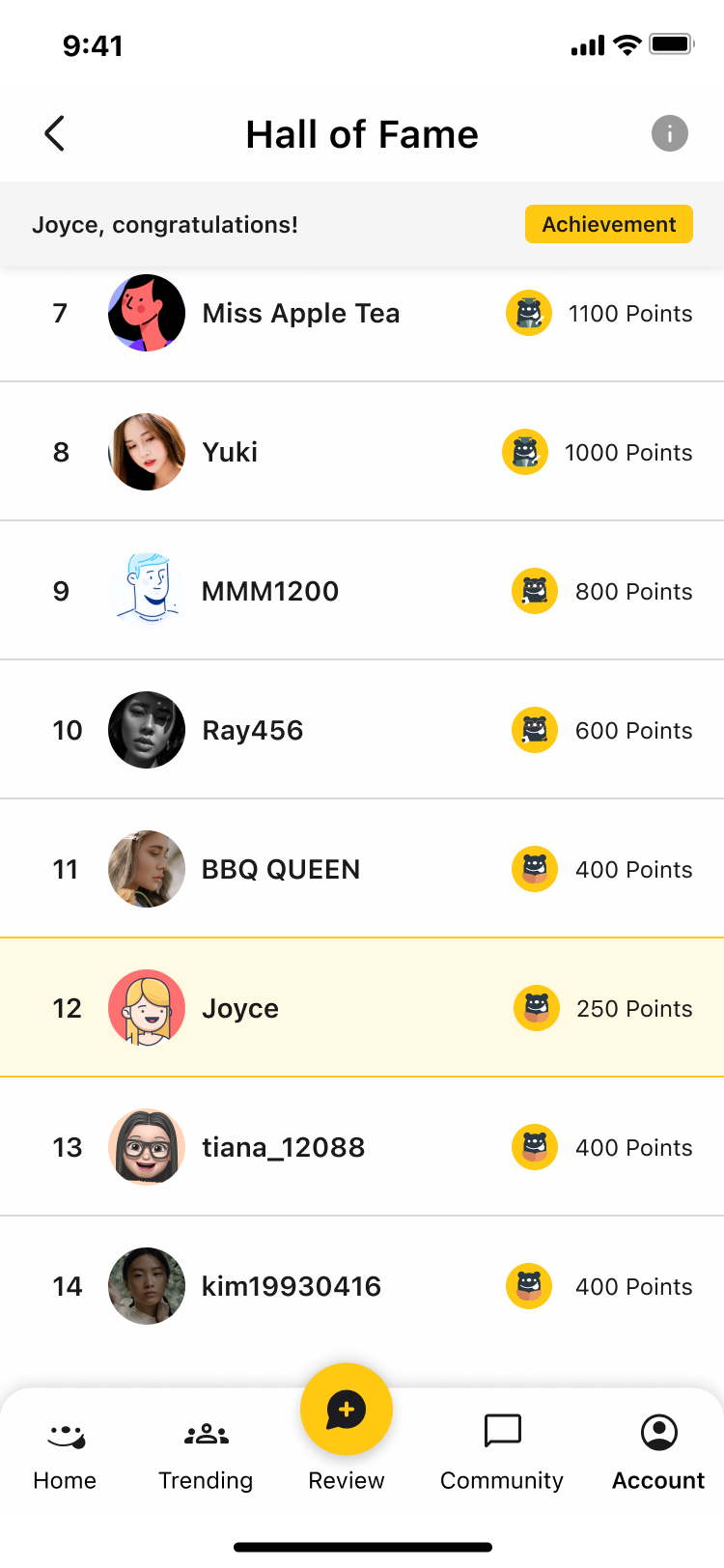
Honor Badges and Hall of Fame recognize active contributors and make participation more visible.
Research revealed limited user-generated content, so we explored lightweight recognition as a way to encourage continued contribution.
05 / Impact
We conducted scenario-based usability testing with 12 target users, including tasks such as creating a post, voting in a poll, and checking achievement status.
What we tested
Participants worked through core scenarios involving community posts, polls, achievement status, and filtering.
Friction found
Advanced filtering caused confusion for some participants.
Design response
We refined filter organization and interaction patterns in response to testing feedback.
Higher perceived usability after usability testing.
Higher satisfaction measured during usability evaluation.
“The new filters finally make the app useful for my life. I feel like the app is designed for people like me now.”
06 / Reflection
The project reinforced that better discovery isn't about adding more restaurants or filters—it’s about helping people narrow choices around what matters to them.
Designing forums alone wasn't enough. Recognition, polls, and lightweight contribution paths helped us explore how community content could become more useful.
Usability testing exposed friction in advanced filters and reinforced the importance of treating validation as another design cycle rather than a final checkpoint.