Content Audit
500+ pages
Audited the Citizenship Resource Center to identify duplicated, outdated, and overlapping content.
Restructuring complex citizenship information around how people actually search, understand, and navigate it.
01 / OVERVIEW
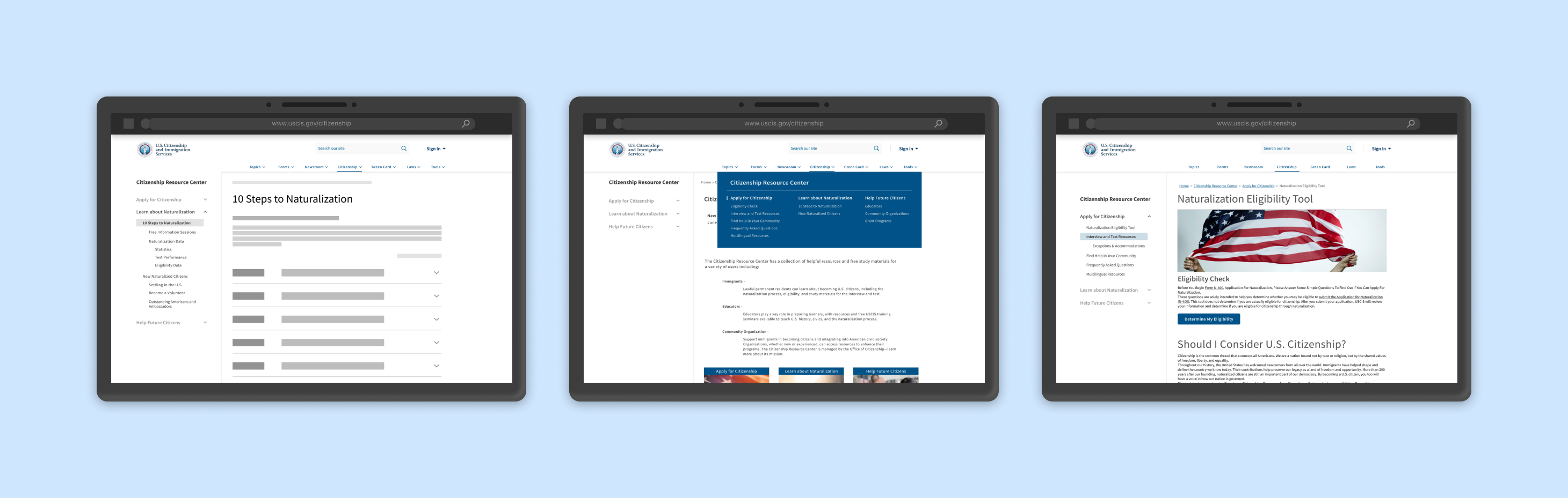
The USCIS Citizenship Resource Center brings together citizenship information and resources for applicants, educators, and community organizations. But its breadth also created a navigation challenge: users had to make sense of dense content, overlapping categories, and terminology that did not always match how they thought about their goals.
Our team explored how the information architecture could better reflect users’ mental models and make critical citizenship information easier to find.
The existing Citizenship Resource Center relied heavily on role-based categories such as Learners, Educators, Organizations, and Grants. Research suggested that these labels did not consistently match users’ mental models, while overlapping pages and technical terminology made important information harder to locate.
How might we reorganize citizenship information around what users are trying to accomplish—not what the system expects them to call themselves?
02 / RESEARCH
We combined content analysis, evaluative research, and user research to understand both the scale of the existing system and where its structure diverged from users’ expectations.
500+ pages
Audited the Citizenship Resource Center to identify duplicated, outdated, and overlapping content.
15 participants
Explored how people searched for citizenship information, interpreted labels, and made sense of the existing navigation.
Findability emerged as a major issue
Evaluated the experience using Abby Covert’s IA heuristics, surfacing issues with findability, clarity, and content overload.
35% baseline success
Tested the existing categories to understand where users expected citizenship content to live.
Stakeholder Interview · Competitive Review · Content Crawling
“I couldn’t find the right section, so I just Googled it.”
Dense pages and overlapping content increased the effort required to locate relevant information.
Categories such as Learners, Educators, Organizations, and Grants did not consistently reflect how participants described their goals.
Labels such as “Grants” and “Civic Integration” were difficult for some participants to interpret without additional context.
03 / DESIGN
Research pointed to a clear direction: organize navigation around what users want to accomplish rather than requiring them to identify with an audience group.
We replaced role-based categories with task-oriented navigation, helping users start from what they wanted to accomplish rather than deciding which audience group they belonged to.
Before
After
Research revealed overlapping content across separate pages, forcing users to navigate multiple paths for related information. We consolidated related content into a single destination to reduce redundancy and cognitive load.
Before · Separate pages
After · Combined page
We replaced vague, technical, and inconsistent labels with clearer, more actionable language that better matched users' mental models and made destinations easier to understand.
Before
Support Your Community
After
Become a Volunteer
Before
Employers
After
Workplace
Before
Civic Integration New U.S. Citizens
After
New Naturalized Citizens
The final architecture brought the redesign decisions into one system—consolidating overlapping content, simplifying hierarchy, and organizing citizenship resources around clearer user goals.
The final IA reorganized citizenship content into clearer, task-oriented categories while reducing overlapping paths.
Behind the final structure, we documented how individual pages were renamed, combined, and repositioned throughout the redesign.
04 / VALIDATION & IMPACT
We iteratively tested and refined the proposed information architecture through card sorting. As categories and labels became more aligned with participants’ mental models, overall sorting success increased across iterations.
Increase in overall card-sorting success from the original to final IA.
+32 pp
35% → 67% across iterations.
Clearer
Fewer participants relied on uncertain placements as labels and groupings were refined.
Task-Oriented
The final structure shifted navigation from organizational roles toward user goals and tasks.
05 / REFLECTION
This project changed how I think about information architecture. The challenge was not simply reducing the number of pages—it was understanding the language and mental models people brought with them, then designing a structure that met them there.
It also reinforced the value of combining large-scale content analysis with direct user research: the audit revealed where complexity existed, while interviews and card sorting helped explain why it mattered.
If the project continued, I would focus the next round of validation on findability, accessibility, and responsive navigation.
Validate whether users can efficiently locate key information within the redesigned hierarchy.
Evaluate navigation and content against accessibility and plain-language requirements.
Explore how the redesigned hierarchy translates across desktop and mobile experiences.